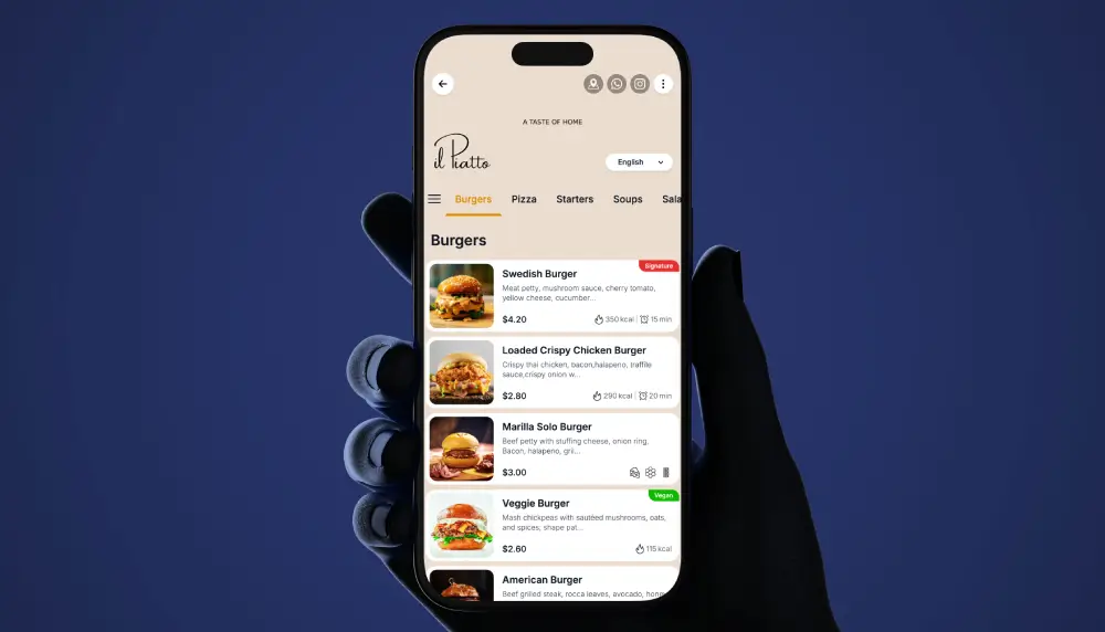
Fine dining has a different bar. The menu is part of the experience, and anything that feels like fast food breaks the spell. A premium QR menu keeps the elegance of print, adds beautiful photography, wine pairings and tasting-menu clarity, and stays browse-only, so your servers remain the ones guiding the table.
Guests scan, read, and consider at their own pace, then order with their server exactly as they should. Nothing is installed, nothing is rushed, and your service stays yours. This guide covers how to design a premium menu that earns its place in the room, and how to launch one in days.
How to design a digital menu that feels luxurious
Restraint is the whole game. The difference between premium and generic is almost never more features. It is fewer, chosen well.
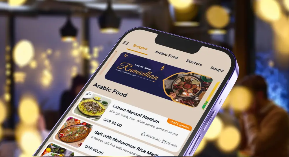
Give the menu generous spacing so the eye rests. Use a refined typeface, a serif for headings if it suits your brand, and a muted palette drawn from your dining room rather than a bright template. Choose a few striking photographs instead of a picture on every line, because a wall of images reads as casual, not considered. Group by course, let the tasting menu breathe, and keep prices quiet and clear rather than bold and loud.
The test is simple: the menu should feel like an extension of your interior, not like a food-delivery app opened at the table. For the mechanics of branding and layout, see our guide to QR menu design.
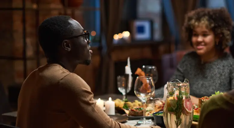
Premium menu design principles for fine dining
Five principles separate a premium menu from a generic one:
- One hero image per course, not per dish. Photography should punctuate, not paper the page.
- A single accent color, taken from your brand, used sparingly.
- Serif headings and a clear reading hierarchy, so the eye moves from course to dish to detail.
- Wine and pairings shown beside the dish they belong to, not buried in a separate list.
- No clutter. No badges, no pop-ups, no “bestseller” tags. Elegance is what you leave out.
Get these right and the menu flatters the food. Get them wrong and the most expensive dining room in the city can feel like a canteen on the phone.
Wine, tasting menus and pairings
Fine dining lives on the wine list and the tasting menu, and both are where paper fails most expensively. A tasting menu printed today is wrong the moment the kitchen adjusts a course. A wine list printed this week is wrong the moment the sommelier pours the last of a vintage.
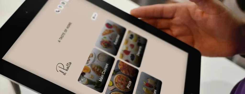
A premium QR menu shows the tasting menu as a guided sequence, course by course, with pairings set beside each one so the table understands the journey before it begins. When the sommelier swaps a bottle or the chef changes the fish course, you update it in seconds and every guest sees the current version on the next scan. No reprint, no crossed-out lines, no apologising for an out-of-date list.
This alone is often the reason a fine-dining room moves to a digital menu, and keeps it.
Front-of-house flow, without rushing service
A well-built menu shortens the distance between seated and decided, and it does that without ever hurrying the guest. Clear courses, legible pairings and a logical order help the table choose with confidence, which means your servers spend their time on hospitality and recommendations rather than re-reading the specials for the fourth time.
Because the menu is browse-only, the rhythm of service stays entirely in your team’s hands. The guest reads, the server guides, the order is taken the way it always has been. You are upgrading the menu, not replacing your people. In fine dining that distinction is the point, and it is why browse-only is the right model here rather than a limitation.

Smart personalization that feels like a sommelier, not a pop-up
Guidance belongs in fine dining, but only when it feels human. Subtle “pairs well with” notes, a quiet chef’s suggestion beside a signature dish, a gentle nudge toward the pairing flight: these help the table without nagging it.
What does not belong is the language of e-commerce. No “customers also bought,” no urgency banners, no upsell interruptions. The menu should feel like a knowledgeable host making a considered suggestion, then stepping back. Restraint, again, is what keeps it premium.
Multi-language and accessibility, inclusivity that feels effortless
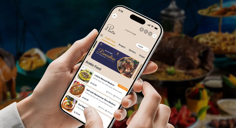
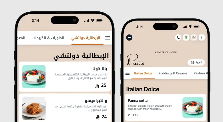
Premium rooms serve international guests, and a guest who can read the menu in their own language orders with more confidence and enjoys the meal more. Offer the menu in the languages your guests actually speak, with correct layout for right-to-left scripts where needed, and keep type large enough to read comfortably in low, atmospheric lighting.
Accessibility and elegance are not in tension when the design is disciplined. Good contrast, generous type and clean structure serve every guest at once. For the setup, see multilingual and multi-currency menus.
Allergen, calories and nutrition for discerning diners
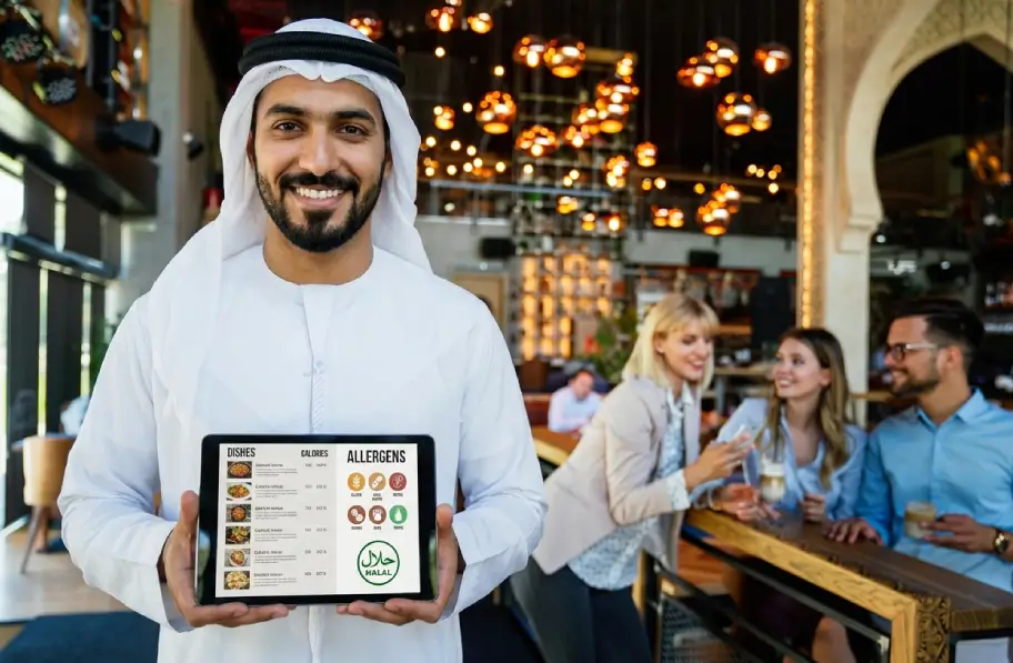
High-end guests ask precise questions, and they expect precise answers. Tag allergens per dish, note preparation details where they matter, and present it all cleanly rather than clinically, so the information is there for those who want it and invisible to those who do not.
Done well, this builds trust and saves your servers from repeating the same dietary conversation at every table. Done on paper, it is either missing or crammed into a footnote no one reads. See allergens, calories and nutrition for how the fields work.
Paperless and sustainability, standards kept high
Cutting reprints is a cost saving and a sustainability story, and both fit a premium brand well. Fewer printed menus, no laminating, no waste every time a price or a vintage changes, and a lighter footprint you can mention honestly to guests who care about it.
For a room that changes its menu often, the printing savings alone are meaningful over a year. The sustainability angle is the part your guests will notice and appreciate.
How to launch your fine-dining QR menu with TableQR
You do not build this yourself. We design and build the premium menu with your branding, your photography and your wine list, and have it live in days.
- Concierge: our team manages every update for you, from a new tasting menu to a changed vintage. Fully managed, ongoing.
- Signature: we complete the professional setup and branding, then hand it over, and your team runs the daily updates. Yours to run after we set it up.
Either way the menu is browse-only, so it sits alongside your existing service and payment process rather than on top of it. Nothing about how you take orders or bill the table changes. For plan details, see pricing.
WE BUILD IT. YOU SEE IT FIRST.
Send us your menu and let our team do the heavy lifting. We’ll build, brand, and translate a custom preview for your venue completely risk-free.